6 Oct 2025
By
Sushant Kumar
0 comment(s)
Color Psychology in Apparel Branding
Color psychology is a powerful tool in the apparel industry, influencing emotions, decisions, and how brands are perceived. In India, where colour meanings vary across regions and traditions, understanding these nuances is essential for connecting with diverse audiences. For instance, red often signifies celebration, while white can mean purity or mourning, depending on the context.
Key takeaways:
- Colours directly impact consumer behaviour: 85% of purchase decisions are influenced by colour, and consistent use can improve brand recognition by 80%.
- Cultural relevance matters: Indian brands like Masaba and Raw Mango use colour to evoke emotions and build strong identities.
-
Colours evoke specific emotions:
- Red: Energy and passion; ideal for festive or bold designs.
- Blue: Trust and reliability; perfect for professional wear.
- Green: Balance and eco-consciousness; resonates with modern consumers.
- Black: Elegance and sophistication; favoured for premium apparel.
- Data-driven choices improve results: AI tools like Stylumia predict colour trends with up to 95% accuracy, increasing sales and reducing waste.
Color Analysis vs. Brand Strategy: How They Pick Colors That Work - or Don’t!
How Colours Affect Emotions and Brand Perception in Apparel
Colours influence emotions in ways that go far beyond personal preference. Imagine the instant impression a bright red kurta or a navy blue blazer can create - it’s not just about aesthetics; it’s about shaping how a brand is perceived and driving purchase decisions.
This connection between colour and emotion becomes even more intricate in India, where diverse cultural interpretations of colours vary widely across regions and communities. A colour that symbolises joy and celebration in one area might carry an entirely different meaning elsewhere. For apparel brands, navigating these subtleties is essential to resonate with their audience.
Consumer psychology research reveals that colours engage the limbic system, the part of the brain responsible for emotions and memory. For apparel brands, choosing the right colours can leave a lasting impression. Let’s explore how specific colours evoke emotional connections and influence branding in the apparel industry.
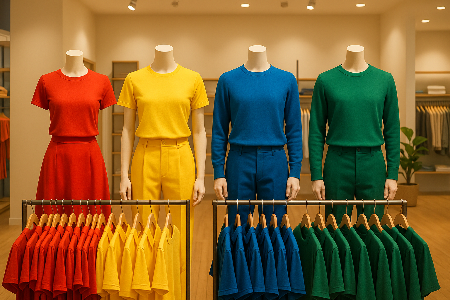
Red: Energy and Passion
Red is bold, vibrant, and impossible to ignore. In India, it’s deeply rooted in tradition, often symbolising celebration and auspiciousness - from bridal lehengas to festive attire. Its emotional intensity makes it a powerful choice for apparel branding.
When used thoughtfully, red can evoke feelings of energy, passion, and urgency. This makes it a go-to colour for sale promotions and limited-time offers, where quick decisions are encouraged. But there’s a fine line - too much red can feel overwhelming or even provoke anxiety. The trick lies in moderation, using red as an accent or for specific product lines rather than letting it dominate the brand’s visual identity.
For custom apparel, red is especially effective in designs for sports teams, event merchandise, or statement pieces where high visibility is key. Designers should carefully balance red with complementary colours to ensure its impact remains strong without overpowering the overall design.
Blue: Trust and Dependability
Blue is a universal favourite, often associated with trust, reliability, and calmness. Across cultures - including India - it signals stability and professionalism, making it a staple for brands aiming to build credibility.
The calming nature of blue makes it ideal for corporate wear, uniforms, and professional apparel. Different shades of blue convey different messages: navy blue suggests authority, royal blue exudes confidence, and lighter blues feel approachable and fresh.
Another advantage of blue is its versatility - it pairs effortlessly with other colours, allowing brands to maintain a consistent identity while experimenting with seasonal or design variations. For businesses creating custom apparel, blue’s broad appeal makes it a strong choice for corporate merchandise, team uniforms, and professional wear, offering a polished and trustworthy look.
Green: Balance and Sustainability
Green has undergone a transformation in its branding role. While traditionally tied to nature and tranquillity, it now represents sustainability, ethical practices, and environmental consciousness - values that are gaining traction among Indian consumers.
Psychologically, green fosters feelings of balance and harmony. Its soothing qualities make it an excellent choice for brands that want to communicate stability, reliability, and ecological responsibility. In India’s increasingly eco-conscious market, green signals a commitment to sustainable practices, whether through organic materials or ethical production methods.
Different shades of green - like forest green, olive, or bright green - can convey a range of messages, from luxury and sophistication to earthiness and vitality. Using green sparingly, such as for accents or specific product lines, can help brands highlight their eco-friendly values without overwhelming their designs.
Black: Elegance and Sophistication
Few colours can match the timeless appeal of black. It’s synonymous with sophistication, authority, and elegance, making it a favourite for premium apparel brands. Its universal resonance ensures it appeals across various consumer segments in India.
Black is often used to signal high quality and craftsmanship, making it a natural choice for luxury and contemporary designs. It also serves as a versatile backdrop for accent colours, allowing other elements to shine while maintaining a polished look.
From a practical standpoint, black offers functional benefits too. It creates a slimming effect, hides imperfections, and exudes formality, making it a staple for corporate merchandise, event wear, and personalised custom apparel. The key to using black effectively lies in the material’s texture and quality - these must align with the premium image the colour evokes.
Why Colour Consistency Matters for Brand Recognition
Imagine recognising a brand just by its colours - that’s the power of sticking to a consistent palette. Studies show that colour can boost brand recognition by up to 80% [2][3]. It’s a simple yet powerful way to build a strong visual identity that sticks in people’s minds.
When a brand uses the same colours across its logos, websites, clothing, and packaging, it creates a unified image that feels reliable and memorable. This isn’t just about aesthetics - it’s about trust. A consistent colour scheme signals professionalism, while inconsistent colours can confuse customers and make a brand seem less dependable [1].
Take global brands as examples. Nike’s black-and-white palette reinforces its image of strength and performance, making it instantly recognisable and fostering loyalty. Similarly, Zara’s sleek, minimalist tones and H&M’s bold red colour scheme help cement their market positions and convey their brand values [1].
Of course, achieving uniformity isn’t always easy. Variations in lighting, fabric types, and printing methods can affect how colours appear [1]. Custprint tackles these challenges head-on. With over 40 years of experience, they oversee every step of production - from order placement and design proofing to manufacturing and delivery - ensuring tight quality control and consistent colour management.
In India, colour consistency takes on an added layer of importance due to cultural associations. Red often symbolises celebration, while green represents prosperity. Brands need to carefully choose palettes that align with these cultural meanings to connect with their audience on a deeper level [1].
Ultimately, inconsistent colours can weaken a brand’s emotional impact and make it less memorable. Regular audits, standardised colour codes, and strict quality checks are essential to maintaining a strong, recognisable identity [1].
sbb-itb-410132b
Colour Preferences Across Different Consumer Groups in India
Understanding what colours resonate with different age groups in India can offer brands a clear edge in connecting with their audiences.
Gen Z consumers in India are drawn to vibrant, bold colours. Growing up in a digital-first world, they lean towards hues that let them stand out and express their individuality. In traditional apparel, they often mix bold colours with metallic accents, creating a blend of modern style and cultural heritage.
Millennials, on the other hand, typically prefer neutral, understated tones. Their everyday style reflects simplicity and minimalism. However, when it comes to festive or celebratory apparel, they appreciate the addition of bold colours or metallic details for a touch of glamour.
These generational preferences highlight the need for brands to craft colour strategies that speak to their target audiences. For instance, platforms like Custprint can use these insights to design collections that appeal to both Gen Z’s love for bold statements and Millennials’ preference for subtle elegance. Whether it’s digital-first designs or traditional apparel, strategic colour choices can make a significant impact in capturing consumer interest.
How to Use Colour Psychology in Apparel Branding
Choosing the right colours for your brand isn’t just about aesthetics - it’s about strategy. Successful apparel brands use a mix of consumer insights and testing to craft colour palettes that truly connect with their audience.
Using Data to Guide Colour Choices
Thanks to modern technology, the process of selecting colours has become much more precise. AI-powered tools are now capable of analysing global consumer behaviour to predict which colours will resonate in specific markets. For example, in March 2021, the Indian startup Stylumia unveiled an AI-driven demand-sensing platform. This tool analyses global trends to rank products by style and colour, helping brands improve their prediction accuracy by up to 30%. During the pandemic, one omni-channel retailer used Stylumia to predict shifting consumer preferences with an impressive 95% accuracy within six to eight weeks [4]. The result? A 25% to 50% boost in sales and revenue.
Beyond just improving sales, these insights have had a broader impact. Brands using data-driven colour strategies have reduced excess inventory and cut their carbon footprint by up to 40%. Some have even scaled back production by over 60 million garments while still increasing profits and sales [4].
Traditional methods, like surveys and focus groups, are still vital. They provide direct feedback on how different demographic groups perceive colours. For instance, younger shoppers may prefer bold, vibrant shades, while older consumers often lean towards more classic and muted tones.
A/B testing is another effective way to gauge colour performance. By presenting various customer groups with different colour schemes, brands can determine which ones drive higher sales and engagement. This is especially important when you consider that up to 90% of snap judgements about products are based on colour [5].
Indian brands offer great examples of how strategic colour choices can strengthen a brand’s identity. Fabindia’s use of rich earth tones reflects tradition and authenticity, appealing to consumers who value a connection to their roots. On the other hand, Biba’s vibrant palette - featuring colours like pink, orange, and yellow - captures a sense of joy and energy, fostering emotional connections with its audience [5].
These insights naturally pave the way for digital customisation, allowing brands to fine-tune their colour strategies even further.
Customisation and Experimentation
Once brands gather analytical insights, digital customisation tools can help refine colour strategies in real time. These platforms make it easier to experiment with different palettes, reducing the costs and risks of physical sampling.
Take Custprint’s 'Create it' tool, for example. It lets users try out various colour combinations across a range of apparel, from basic tees priced at ₹249 to premium hoodies at ₹899. This approach ensures that colour choices align with both product positioning and customer expectations.
Platforms like Custprint follow a four-step manufacturing process - order placement, artwork proofing, manufacturing, and delivery. The artwork proofing stage is particularly useful, giving brands a chance to see exactly how their selected colours will look on the final product before committing to large production runs.
In India, cultural relevance plays a key role in colour experimentation. Brands can test traditional colour associations, such as saffron for purity or festive combinations, to see how they perform across different regions and demographic groups. This ensures that colour choices resonate with local values while staying consistent with the brand’s identity.
The flexibility offered by modern customisation platforms is another game-changer. With options like no minimum order quantities, brands can test various colour combinations without taking on significant financial risks. This allows for ongoing experimentation and refinement, creating a feedback loop that strengthens the connection between the brand and its chosen colours over time.
Conclusion: The Power of Colour in Apparel Branding
Colour psychology plays a pivotal role in shaping how products are perceived and influences consumer choices in the world of apparel branding. By using colours thoughtfully, brands can create visually striking products, establish emotional connections, and ultimately drive their growth.
In India, the impact of colour is particularly profound. With its diverse cultural landscape, selecting colours that resonate emotionally and align with regional preferences can make a significant difference. When backed by data-driven insights, these choices become even more effective in connecting with consumers on a deeper level.
Modern customisation platforms, like Custprint's seamless four-step process - from placing an order to final delivery - bring strategic colour decisions to life. These platforms not only allow for precise and personalised apparel designs but also empower customers to co-create. For instance, Custprint enables users to configure emblems, deciding where patches or logos should be placed on garments. This approach provides brands with valuable insights into consumer preferences while allowing individuals to express themselves through customised designs.
The shift towards a no-minimum-order model has also changed the game. Brands can now test various colour combinations without committing to large-scale production, offering flexibility and reducing risks. Products, ranging from ₹249 T-shirts to ₹1,099 jackets, can be produced in small batches, enabling brands to gather feedback and refine their strategies. This agile approach aligns with the industry's growing emphasis on being responsive to market demands and fostering continuous innovation.
FAQs
How can apparel brands in India use colour psychology to strengthen brand identity and build customer loyalty?
Apparel brands in India can tap into colour psychology to create a stronger emotional connection with their audience. Colours hold deep cultural and emotional meanings here. Take red, for example - it's seen as a symbol of auspiciousness and passion, making it a powerful choice for grabbing attention and stirring emotions. On the other hand, blue conveys trust and reliability, which can help brands establish credibility and foster recognition.
Equally important is understanding the regional preferences and behaviours of Indian consumers. By aligning colour choices with local traditions and sentiments, brands can forge meaningful connections, showcase their values, and nurture lasting loyalty in a diverse and vibrant market.
How does cultural significance influence colour choices in apparel branding for a diverse market like India?
In India, colours hold profound cultural and emotional significance, playing a key role in how apparel brands resonate with consumers. Take red, for instance - it symbolises prosperity and passion, and is deeply tied to weddings. Similarly, yellow and gold are seen as symbols of spirituality and auspiciousness. Meanwhile, green represents renewal and harmony, aligning with traditional values.
When brands tap into these cultural meanings, they can craft designs that strike an emotional chord with Indian consumers. Thoughtful use of colour not only demonstrates cultural awareness but also builds trust and loyalty in India's diverse and vibrant market.
How do AI and data insights help apparel brands stay ahead in colour trends?
AI-powered tools and data analytics are reshaping how apparel brands stay on top of colour trends. By sifting through massive datasets from social media, fashion events, and customer preferences, these tools can pinpoint emerging patterns and popular shades. This helps brands craft collections that align with shifting consumer tastes.
Take, for instance, the ability of AI to forecast trending colours - like bold oranges, striking digital blues, or earthy greens - by analysing purchasing habits and societal influences. With this insight, brands can make timely, informed decisions and design clothing that truly resonates with their audience.