6 Sept 2025
By
Sainyam Khanna
0 comment(s)
Color Theory Basics for Custom T-Shirts
Understanding color theory can transform your t-shirt designs into visually appealing and impactful creations. Here’s the essence:
- Color Theory Fundamentals: Learn how colors interact, evoke emotions, and influence perception.
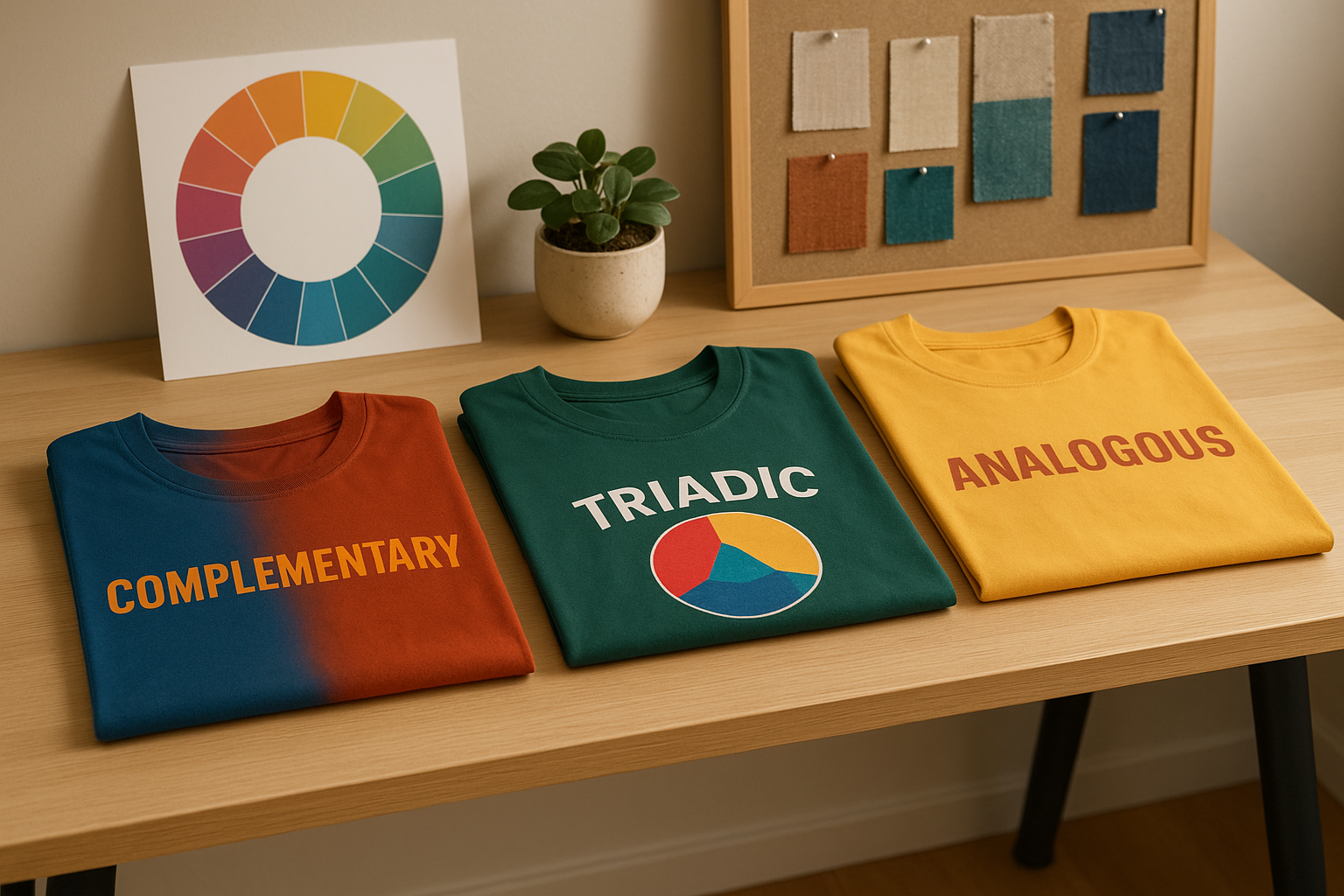
- Color Wheel Basics: Primary (red, yellow, blue), secondary (green, orange, violet), and tertiary colors form the foundation for harmonious combinations.
- Warm vs Cool Colors: Warm tones (red, orange, yellow) are energetic and attention-grabbing, while cool tones (blue, green, purple) evoke calmness and trust.
-
Popular Color Schemes:
- Complementary: High contrast, bold combinations like red-green or blue-orange.
- Analogous: Neighboring colors for a harmonious look.
- Monochromatic: Variations of one color for a clean, elegant design.
- Contrast and Readability: Ensure designs stand out by pairing light inks with dark fabrics and vice versa.
- Cultural and Psychological Impact: Colors like saffron, green, and gold hold special significance in India, especially during festivals and events.
With tools like Custprint’s ‘Create it’ tool, you can test and refine your designs for accurate color reproduction. Pairing the right shades with suitable printing methods ensures your t-shirts are not just visually appealing but also meaningful.
How To Pair Ink Colors To Your Tee
Popular Color Schemes for T-Shirt Design
Choosing the right colour combinations can make or break your custom t-shirt designs. With a thoughtful approach, you can create designs that not only look great but also connect with your audience on a deeper level.
As Mads Soegaard, a design expert, explains,
"Complementary colors sit on the opposite ends of the color wheel - such as orange and blue, red and green, and yellow and purple - and play a key role in creating harmony while directing users' attention to key areas, such as calls-to-action" [2].
Understanding how colours interact is vital, especially when research shows that over 60% of people decide to accept or reject new products based on colour [2]. Let’s dive into some popular colour schemes that can bring your designs to life.
Complementary Colors
Complementary colours are opposites on the colour wheel, creating bold and eye-catching combinations. These high-contrast pairs are perfect for making certain elements pop. Some classic examples include:
- Red and Green: Great for festive designs or safety-related themes. Best used sparingly for text to avoid overwhelming the viewer.
- Blue and Orange: Evokes the energy of sunsets, adding vibrancy to your design.
- Yellow and Purple: Offers a refined and elegant feel, ideal for high-end projects.
These combinations work wonders for drawing attention to specific areas of your design. Just be sure to keep the contrast between the t-shirt colour and the printed design high for maximum readability [1].
Analogous Colors
Analogous colour schemes use colours that sit next to each other on the colour wheel. They create a harmonious and calming effect, making them a versatile choice. To make the most of this scheme:
- Choose a dominant colour and complement it with adjacent hues.
- Experiment with different shades and tints to add depth.
- Use neutral tones to balance the overall palette [4].
"Analogous colour schemes are perfect for creating tranquil, balanced spaces while still allowing for creative variation and visual interest." – The Interior Design Institute [3]
This approach works beautifully for both modern and classic t-shirt designs. It strikes a balance between creativity and sophistication without overwhelming the viewer.
Monochromatic Colors
Monochromatic colour schemes focus on variations of a single hue, using different tints, shades, and tones to create a cohesive and minimalistic look [8][6]. This technique is all about subtlety and elegance, making it ideal for clean, professional designs.
- Apple: Their white and grey palette exudes simplicity and sophistication [6].
- The Matrix: The iconic green variations maintain visual intrigue [7].
- Ozark: The series showcases a striking blue-tinted aesthetic [7].
Monochromatic schemes are not just for t-shirts - they’ve been a staple in fashion, with icons like Audrey Hepburn and Jackie Kennedy popularising this style. Surveys even show that blue is a universally loved colour for ink [6]. To enhance these designs, try incorporating white or black for contrast, or add textures and patterns to break up large blocks of colour [8].
Designer and marketer Nastya Kuliábina shares her tip:
"I employ the 60-30-10 color proportion rule, where I designate a primary color (60%) to serve as the canvas for highlighting the complementary (30%) and accent (10%) colors" [8].
Monochromatic palettes are perfect for achieving a timeless and polished look [5].
Contrast and Readability in T-Shirt Design
The right contrast between design and fabric can elevate a t-shirt from ordinary to eye-catching. It ensures that the message or artwork grabs attention, even from a distance. Achieving this requires some practical techniques to make every detail stand out clearly.
To enhance text visibility, pair dark ink with light shirts and light ink with dark shirts [9]. A quick way to test this is by viewing your design in greyscale [10]. Without colour, you'll immediately see if the contrast is strong enough. If the details seem to fade or blend into the fabric, they might not stand out when printed either.
Matching Ink and Fabric Colours
The interplay between ink and fabric colours can make or break a design. Light fabrics often call for darker inks to ensure bold, vibrant results, while dark fabrics work best with lighter inks for maximum clarity [11]. Classic high-contrast combinations - like white designs on black shirts or black designs on white - create a clean, professional look. Other effective pairings include white on navy or black on bright blue. On the flip side, avoid pairing colours that are too similar, like red on black, unless you add accents like white for better visibility. For a dramatic effect, red on black with white highlights can be stunning.
These guidelines form a strong foundation for considering local preferences and trends in India.
Popular T-Shirt Colours in India
While contrast is key, understanding popular colour trends in India can add another layer of appeal to your designs. White t-shirts are a versatile favourite, offering a blank canvas for vibrant or multi-coloured prints. Black t-shirts, on the other hand, provide a striking backdrop for neon shades, light blue, or warm orange designs.
Navy blue t-shirts have become a popular choice too. White prints on navy create a refined and balanced look, while accents like lime green can add a playful touch.
Coloured t-shirts are especially popular during festivals and casual gatherings, offering endless creative opportunities. Eye-catching combinations like red, green, and gold on white or grey fabrics can resonate deeply, while blue on yellow adds a fun, energetic vibe.
It’s important to remember that printing techniques can influence how colours appear on fabric, so testing your combinations before finalising the design is a smart move [12].
Colours also hold cultural significance in India. Saffron, white, and green are prominent during national celebrations, while red and gold are often associated with festive occasions. Keeping these cultural connections in mind can give your designs a meaningful edge.
sbb-itb-410132b
Colour Psychology and Indian Preferences
Building on basic colour theory, understanding the psychological and cultural significance of colours can make your designs far more impactful. The colours you choose for custom t-shirts don’t just influence individual emotions - they tap into cultural traditions and meanings that have been passed down for generations.
How Colours Affect Emotions
Colours have a powerful psychological influence - studies reveal that up to 90% of product decisions are based on colour alone [13]. Each shade has its own emotional impact and shapes how designs are perceived. For example:
- Red sparks energy, passion, and urgency.
- Blue creates a sense of trust and stability.
- Yellow conveys optimism and creativity.
- Green evokes nature, health, and tranquillity.
- Black exudes sophistication and authority.
- White symbolises simplicity and purity.
Using colours thoughtfully can even boost purchase intent by as much as 85% [14]. When it comes to designing custom t-shirts, the right colour palette is essential for both aesthetic appeal and influencing consumer behaviour.
Colour Meanings in Indian Culture
In India, colours carry deep-rooted cultural symbolism. For instance:
- Yellow is associated with divinity and is linked to Lord Vishnu.
- Green represents harmony and new beginnings.
- White, while symbolising peace and purity, can also carry sombre undertones in certain contexts.
- Gold is revered for its association with Lakshmi, the Goddess of Wealth and Success.
These meanings can vary across regions and communities, with local traditions adding unique layers of interpretation. Naturally, these cultural nuances play a significant role in festive or event-specific designs.
Colour Choices for Indian Festivals and Events
Indian festivals are a vibrant showcase of colours, offering endless inspiration for culturally resonant t-shirt designs.
- Diwali: A bright, lively palette is key - gold for prosperity, red for passion and power, yellow for optimism, pink for happiness, green for renewal, and white for purity. Muted tones like brown and grey are avoided, as they don’t align with the festive mood.
- Holi: Known for its explosion of colours, Holi calls for white or light-coloured t-shirts that act as a blank canvas, letting the festival’s vibrant hues shine.
- Weddings: Colour traditions vary by region and ceremony. Red is a classic choice for brides and married women, while Haldi ceremonies favour auspicious shades like yellow and orange. In North Indian weddings, brides often wear red or maroon, while South Indian traditions lean towards yellow and off-white. Muslim and Sikh weddings incorporate colours like green, deep blue, and gold.
Using Custprint for Colour-Perfect T-Shirt Printing
Custprint takes the art of t-shirt printing to the next level by combining colour theory fundamentals with advanced printing techniques. Their process ensures that your designs aren't just vibrant but also true to your creative vision. By blending user-friendly design tools with professional-grade, in-house manufacturing, Custprint guarantees that your custom t-shirts turn out exactly as you imagined.
Selecting Fabric and Print Methods for Best Colour Results
Achieving rich, long-lasting colours starts with choosing the right fabric and printing method. Custprint offers several in-house printing technologies, each tailored to different design needs and colour effects.
- Screen Printing: This method produces bold, vibrant colours that stand the test of time. Perfect for solid designs with fewer colour variations, the ink sits on top of the fabric, creating a striking and durable finish.
- Sublimation Printing: Ideal for detailed designs and a wide colour range, sublimation uses heat to bond dyes directly into the fabric. The result? Colours that resist cracking, peeling, and fading, while offering a smooth, long-lasting finish.
- Direct to Film (DTF) Printing: For intricate designs and gradients, DTF printing delivers high-resolution, vibrant results across various fabrics. It's especially effective for reproducing complex artwork with sharp details and accurate colours.
Custprint selects the best printing method for your design based on factors like size, complexity, and order quantity. Once the method is chosen, their 'Create it' tool helps refine your colour choices for a flawless finish.
Testing Colour Combinations with the 'Create it' Tool
Custprint's 'Create it' tool simplifies the process of choosing and testing colours. This online platform allows you to experiment with different combinations and preview how your design will look on a t-shirt in real time.
One common challenge in printing is the difference between how colours appear on-screen versus in print. The 'Create it' tool bridges this gap by letting you upload your artwork, tweak colours, add text, and try out various design elements - all while updating pricing as you make changes.
To maintain brand consistency, you can save custom colour palettes with values in RGB, Hex, and CMYK. This ensures that your colours remain uniform across all your apparel. Since printing uses the CMYK colour model, converting RGB or Hex values to CMYK is crucial. The 'Create it' tool makes this transition seamless, showing you exactly how your colours will appear in print.
Once you're satisfied with your design, Custprint's rigorous quality controls ensure your colours are faithfully reproduced on the final product.
How Custprint Ensures Accurate Colours
Custprint's expertise in colour accuracy comes from over 40 years of experience and a fully in-house production process. By managing every step - from design approval to final delivery - they maintain complete control over quality.
A key part of their process is the artwork proofing stage. Here, you get to review and approve the final design, ensuring the colours in the proof match the final product. This step is critical because various factors, such as monitor calibration, colour models (RGB vs CMYK), printer specifications, and material properties, can affect the final result. Custprint’s meticulous approach tackles these challenges head-on, offering print samples to verify colours before full production.
Every order undergoes multiple quality checks to ensure both colour precision and print excellence. And with no minimum order requirement, you can place single orders to test colours before committing to larger quantities.
Conclusion
Grasping the basics of colour theory can transform your t-shirt designs into powerful visual messages that truly connect with your audience. Studies indicate that up to 90% of snap decisions about products are influenced by colour alone [10], making your colour choices a crucial factor in your design's success.
From understanding the colour wheel and complementary schemes to leveraging contrast and interpreting colour meanings, these principles give you the foundation to create designs that not only look polished but also evoke the right emotions. Whether you're crafting designs for Diwali with vibrant golds and reds or opting for dependable blues in corporate apparel, these concepts help ensure your colours work in harmony. They also lay the groundwork for using advanced printing solutions.
Custprint's platform takes these principles from theory to practice. With features like the "Create it" tool for real-time colour testing, detailed artwork proofing, and decades of expertise, Custprint ensures your colours are reproduced with unmatched accuracy.
The influence of well-thought-out colour application goes beyond just appearance. Strategic colour choices, grounded in psychological insights, can boost conversion rates, enhance social media engagement, and even lower return rates.
With these insights in hand, your next custom t-shirt project becomes a chance to put colour theory into action. Identify your audience and purpose, pick colours that align with your message, maintain strong contrast, and let Custprint's tools bring your ideas to life.
Every design choice matters - use colours wisely to create designs that resonate with your audience and meet your goals.
FAQs
How can understanding colour psychology improve my custom t-shirt designs?
Understanding colour psychology can play a big role in improving your custom t-shirt designs. Colours aren’t just visual elements - they evoke emotions and shape perceptions. For example, red often represents energy and passion, while blue conveys a sense of trust and calm.
Picking the right colour combinations can make your designs stand out and stick in people’s minds. Whether you’re designing t-shirts for a brand, an event, or personal expression, using colour psychology thoughtfully can help your designs connect with your audience and make a lasting impact.
How can I ensure accurate colours when designing custom t-shirts using Custprint's 'Create it' tool?
To get the colours in your custom t-shirt designs just right with Custprint's 'Create it' tool, start by calibrating your monitor. This ensures the colours you see on your screen are as close as possible to the final printed result. Use high-resolution images and stick to appropriate colour profiles like RGB or CMYK, depending on your design needs. Soft proofing is another handy step - it lets you preview how your colours will look when printed. Lastly, be sure to share any specific colour preferences or requirements when reviewing the artwork proof during the order process. Following these steps will help bring your design to life just the way you imagined it.
What are the best colours for custom t-shirts that reflect Indian cultural values?
When creating custom t-shirts, selecting colours that align with Indian traditions can add depth and charm to your design. For instance, red is deeply tied to power, love, and auspicious moments, while gold reflects wealth and prosperity. Green symbolises growth and harmony, yellow conveys happiness and energy, and pink brings to mind festivity and celebration.
By thoughtfully using these colours, you can craft designs that resonate with Indian cultural values and emotions, ensuring your custom t-shirts leave a lasting impression.