3 May 2025
By
Sushant Kumar
0 comment(s)
Common Custom T-Shirt Design Mistakes and Solutions
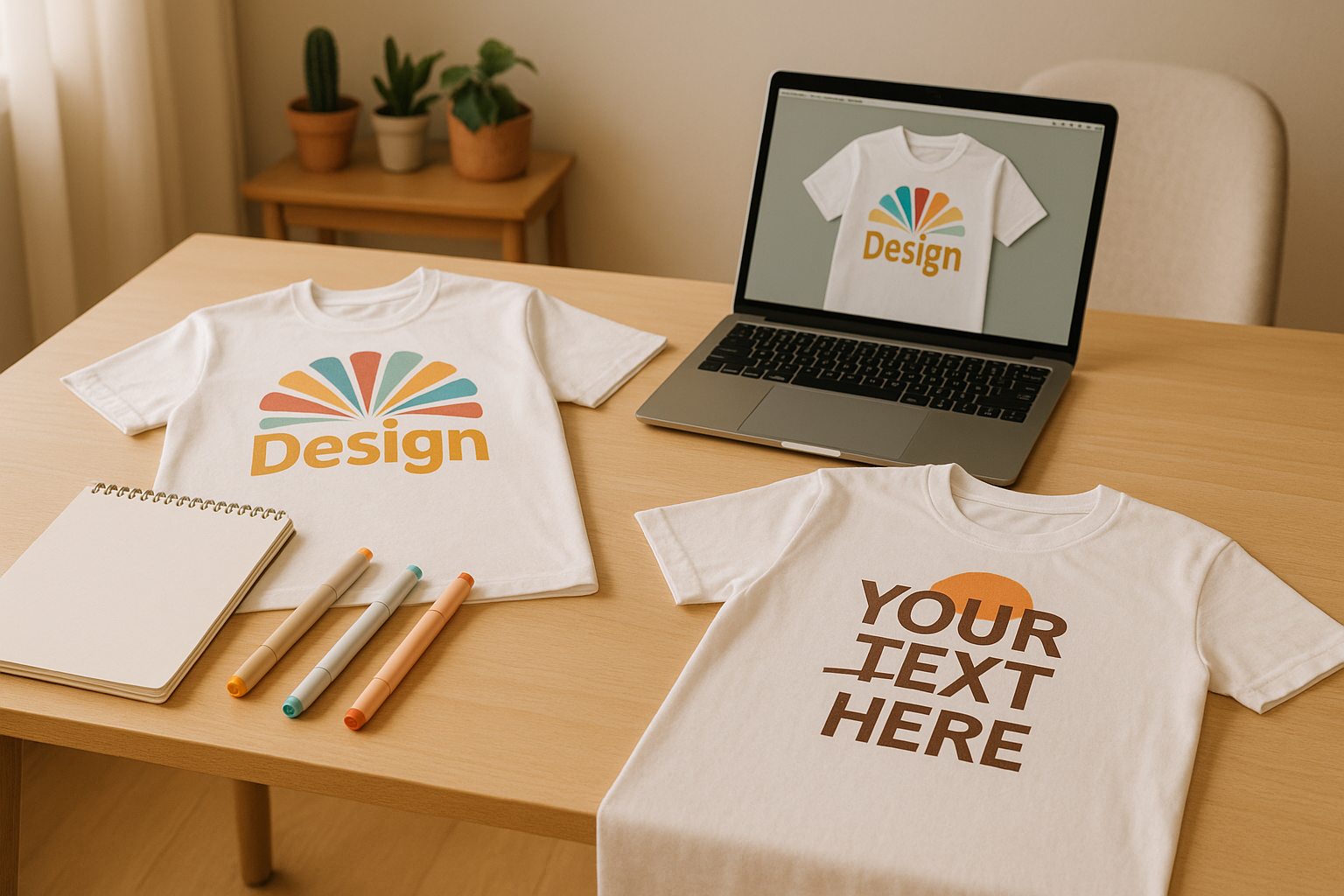
Designing custom t-shirts can be tricky if you don’t know what to avoid. Here are the most common mistakes and how to fix them:
- Low-Resolution Images: Use images with at least 300 DPI to avoid blurry prints.
- Too Many Colours: Stick to a balanced colour palette for clarity and cost-efficiency.
- Font Overload: Limit your design to 3 fonts for readability.
- Poor Design Placement: Ensure the design scales well across all t-shirt sizes.
- Bad Colour Contrast: Avoid combinations like navy on black or yellow on white; choose high-contrast colours.
- Wrong File Formats: Use vector files (AI, EPS) for logos or 300 DPI PNGs for detailed graphics.
Quick Fixes for Better T-Shirt Designs:
- Image Quality: Start with high-res files (300 DPI).
- Colour Choices: Use light-on-dark or dark-on-light combinations.
- Placement: Follow standard measurements for chest, back, and sleeve prints.
- Fabric Type: Choose materials like cotton for vibrant prints or poly-blends for durability.
- Test Before Printing: Always print a sample to check colours and alignment.
Quick Comparison Table:
| Mistake | Impact | Solution |
|---|---|---|
| Low-res images | Blurry prints | Use 300 DPI images |
| Too many colours | Cluttered design, high cost | Stick to 2-3 colours |
| Overused fonts | Hard to read | Limit to 3 fonts |
| Poor placement | Misaligned designs | Follow standard size guidelines |
| Bad colour contrast | Unreadable design | Use high-contrast combinations |
Top 10 T-Shirt Design Mistakes To Avoid
Design Placement Basics
Getting the placement right is what separates professional t-shirt designs from amateur-looking ones.
Common Placement Errors
One frequent mistake is misalignment or using the wrong design size for different garment variations. It's also crucial to factor in age-specific requirements, especially for children's clothing. Below are recommended design sizes for children's t-shirts:
| Age Group | Recommended Design Size |
|---|---|
| Below 6 months | 7.62 x 7.62 cm |
| 6-9 months | 12.7 x 12.7 cm |
| 18+ months | 15.24 x 15.24 cm |
| 2-3 years | 12.7 x 12.7 cm |
| 4-5 years | 15.24 x 15.24 cm |
For adult t-shirts, maintaining consistent placement is equally important to ensure the designs look polished across all sizes.
Standard Placement Measurements
Here are the standard placement guidelines for adult t-shirts:
| Print Location | Standard Placement (from reference point) | Design Size (width) |
|---|---|---|
| Left Chest | 8–10 cm from the collar, aligned with edge | 6.35–12.7 cm |
| Centre Chest | 10–12.7 cm from the collar, centered | 15.24–25.4 cm |
| Full Back | 7.62–10.16 cm from the collar, centered | 25.4–30.48 cm |
| Sleeve | 2.54–10.16 cm from the hem | 2.54–10.16 cm |
These measurements help keep designs proportional and visually balanced, no matter the size of the t-shirt.
Digital Placement Tools
Once you’ve mastered the basics, digital tools can make fine-tuning placements even easier. For instance, Custprint's 'Create it' tool provides a user-friendly interface where you can preview your design on different t-shirt sizes and make real-time adjustments during the proofing process. This ensures your final product looks exactly as intended.
Color Selection and Contrast
Choosing the right colour combinations is essential for creating readable and visually appealing t-shirt designs. Poor choices can make your prints hard to see or unappealing.
Poor Color Combinations
Some colour pairings simply don't work well for t-shirt printing. Here are a few examples:
| Design Colour | T-shirt Colour | Issue |
|---|---|---|
| Navy Blue | Black | Design becomes invisible |
| Light Grey | White | Not enough contrast |
| Yellow | White | Hard to read |
| Dark Green | Black | Design fades into the background |
| Silver | Light Grey | Barely noticeable |
When the design and t-shirt colours are too close, the design blends in, losing its visual impact.
Color Contrast Guidelines
Strong contrast is essential to make your designs stand out. Here are a few tips:
- Light on Dark: Bright colours like white or neon shades work well on dark t-shirts.
- Dark on Light: Black or deep colours pop on light-coloured fabrics.
- Complementary Colours: Pairing colours opposite each other on the colour wheel creates eye-catching effects.
For designs with fine details or thin lines, high contrast is especially important. For example, white on dark or black on light fabrics ensures clarity and readability. This approach is supported by a Bonfire article published on 16 April 2025 [1].
Screen vs. Print Colours
It's important to understand that colours on a screen often look different when printed due to different colour models.
Key Differences Between RGB and CMYK:
- Screens use the RGB model (Red, Green, Blue).
- Printing uses CMYK (Cyan, Magenta, Yellow, Key/Black).
- RGB colours are typically more vibrant than CMYK [2].
Tips for Accurate Printing:
- Design in CMYK Mode: This helps you see how colours will appear when printed.
- Consider Fabric Type: The material affects how colours look:
- 100% cotton produces bold, opaque colours.
- Poly-blend fabrics create a softer, faded effect.
- Dark fabrics may need extra ink layers for the design to stand out.
- Test Before Production: Print a sample to check how the colours turn out. A screen preview won't always match the printed result.
Up next, we'll dive into image quality standards to help you perfect your designs.
Image Quality Standards
When it comes to professional t-shirt printing, getting the image quality right is just as important as nailing the design placement and colour choices.
Resolution Requirements
Sharper prints come from higher resolution images. To achieve clear and crisp results, always work with 300 DPI at the actual print size [3].
Here are some common resolution pitfalls to avoid:
- Using web-optimised images (72 DPI)
- Enlarging low-resolution images
- Setting the wrong DPI
Never try to upscale a low-resolution image - it won’t improve the quality. Always start with 300 DPI to ensure the best results [4]. Once you’ve got the resolution sorted, the right file format is the next step to maintaining print quality.
Recommended File Types
Different projects call for different file formats. Here’s a quick guide:
| File Type | Best For | Limitations |
|---|---|---|
| Vector (AI, EPS, PDF) | Logos, text, scalable designs | Requires design software |
| PNG | Detailed graphics, transparency | Must be at least 300 DPI |
| TIFF | High-quality photos | Large file sizes |
| PSD | Complex layered designs | Requires Photoshop |
Vector files are ideal because they stay sharp no matter the size. For raster images, make sure they’re created at 300 DPI at the final print size [5][6].
File Setup Steps
Once you’ve chosen the right file type, follow these steps to prepare your design:
-
Size Setup
Work at the final print size from the start to avoid scaling problems [8]. -
Colour Profile
Save your file in the sRGB colour profile to ensure consistent colours [7]. -
Background Removal
Eliminate unnecessary backgrounds to avoid unexpected colours in the final print [7]. -
Final Export
- Set the resolution to 300 DPI
- Save as PNG with a transparent background
- Keep the file size under 200 MB
- If using Photoshop, go to "File > Save As > PNG" instead of "Export As" [9]
sbb-itb-410132b
Design Layout Rules
Building on earlier tips about placement and colour, these layout guidelines will help improve your design's clarity and make it stand out.
Simplifying Busy Designs
T-shirt designs need to grab attention immediately. Here's how to keep things clean and effective:
- Keep text short - 2–3 lines with 2–3 words per line.
- Make sure the text height is at least 1/10th of the design area.
- Use bold, thick fonts instead of thin ones.
- Focus on a single main element, with simple supporting details.
After simplifying, check that the layout feels balanced.
Layout Balance Tips
Use these tips to ensure your design stays well-balanced:
| Design Element | Guideline | Common Mistake |
|---|---|---|
| Spacing & Distribution | Keep equal spacing between elements; distribute graphics evenly | Uneven gaps or crowded elements |
| Proportion | Match the design size to the shirt's dimensions | Designs that are too large or small |
| Movement | Consider how the design looks when the shirt is worn | Placing elements in distortion-prone areas |
Once balanced, take a close look at the design before finalising it.
Design Review Process
After refining the layout, go through this review checklist to catch any errors:
-
Style Consistency
Ensure all graphics and text share the same style. Mismatched elements can make the design look unprofessional. -
Message Clarity
"Confused customers don't buy!" - Michael Essek [10]
Your design should deliver its message instantly. If it takes more than a few seconds to understand, simplify it further. -
Visual Balance
- Check if the design feels evenly weighted.
- Make sure text and graphics work together harmoniously.
- Confirm that spacing is consistent throughout.
-
Mockup Testing
Create digital mockups in different sizes to see how the design works on various shirt styles and sizes.
These layout tips complement earlier advice on placement, colour, and image quality, ensuring your design is polished and effective.
Fabric and Print Method Selection
Fabric type and printing method play a crucial role in determining the quality and durability of a t-shirt's design.
T-Shirt Material Types
The fabric you choose directly impacts how well the print stands out and how long it lasts. Cotton is often the go-to option. Here's a breakdown:
| Material Type | Best For | Drawbacks |
|---|---|---|
| 100% Cotton | Everyday wear, vibrant prints | Low-grade cotton may pill |
| Polyester | Athletic wear, moisture-wicking | Less detail in artwork |
| Cotton-Polyester Blend | Comfort and durability | Poor blends can affect prints |
| Organic Cotton | Eco-friendly designs | Higher production costs |
Cotton provides softness and comfort, while polyester is great for retaining shape and colour, making it perfect for sportswear [11].
Print Methods by Design
Pairing the right printing method with your design ensures the best outcome:
| Design Type | Recommended Method | Benefits |
|---|---|---|
| Detailed, Multi-colour | DTG Printing | Retains fine details, unlimited colours |
| Simple, Bold Graphics | Screen Printing | Durable finish, vibrant colours |
| Full Coverage | Dye Sublimation | Edge-to-edge printing, no fading |
| Metallic/Specialty | Direct-to-Film (DTF) | Enhances vibrancy of special effects |
Custprint Fabric Options
Choosing high-quality fabric and aligning it with your design ensures the final product looks polished and professional.
- Premium cotton single jersey, perfect for intricate designs and vibrant colours. Starts at ₹349.00.
Comfort Round Cotton Tee
- Affordable cotton option, ideal for simpler designs. Starts at ₹249.00.
Tips for Best Results
- Material Selection: Opt for lighter fabrics (150-180 GSM) for casual wear; premium cotton works best for detailed designs.
- Usage Considerations: For athletic wear, pick moisture-wicking fabrics; for everyday wear, breathable cotton is ideal.
Pretreatment is essential for achieving sharp, durable prints [12]. Custprint's premium cotton ensures better colour absorption and long-lasting results compared to standard materials.
Conclusion: Steps to Better T-Shirt Designs
Key Takeaways
Creating professional t-shirt designs requires careful attention to detail. Focus on high resolution, balanced typography, good contrast, proper scaling, and the right file formats. Here's a quick overview:
| Element | Best Practice | Common Mistake |
|---|---|---|
| Image Quality | Use high-resolution files | Using low-res graphics |
| Typography | Limit to 3 fonts | Overusing font styles |
| Contrast | Ensure light-dark balance | Poor visibility |
| Design Size | Scale correctly | Incorrect proportions |
| File Format | Use vector for logos | Using compressed files |
Start Designing with Custprint
Bring your designs to life effortlessly with Custprint's tools. Begin with their 'Create it' feature and select from premium fabrics like the Luxe Round Cotton Tee (₹349.00) or the Comfort Round Cotton Tee (₹249.00).
By following the outlined design, colour, and resolution tips, you ensure a smooth production process. Simply upload your design, review the artwork proof, and let Custprint handle the in-house manufacturing and quality checks before delivery.
Plus, Custprint's design team reviews your artwork to catch potential issues early, saving you both time and effort.
FAQs
How can I make sure my t-shirt design looks the same in print as it does on my computer screen?
To ensure your t-shirt design matches what you see on your screen, keep in mind that colours on screens often appear more vibrant due to backlighting. Follow these tips to minimise differences:
- Choose colours carefully: Colours may look slightly different in print compared to on-screen. Avoid overly bright or neon shades unless you're certain they can be accurately printed.
- Check your screen settings: Turn off night mode and calibrate your monitor's brightness and colour settings for better accuracy.
- Use the right colour mode: Design in RGB, but confirm with your printer if they require CMYK conversion for printing.
Taking these steps will help you create a design that translates well from screen to fabric, ensuring your custom t-shirts look professional and polished.
What are the best tips for selecting colours to make my custom t-shirt design stand out?
To ensure your t-shirt design stands out, focus on contrast and colour harmony. Choose colours that contrast sharply with your t-shirt's base colour - like dark designs on light shirts or vice versa - to make the design pop. Avoid using shades that are too similar, as they can blend into the shirt and reduce visibility.
Experiment with colour combinations that complement your design and theme. For instance, black shirts pair well with white or maroon designs, while pastel shades like pink work beautifully with light blue or yellow prints. Use mockups to visualise how your chosen colours will look on the shirt before printing.
Lastly, consider the subject matter of your design. The colours should align with the message or aesthetic you aim to convey. This thoughtful approach ensures your t-shirt design is both eye-catching and meaningful.
How can I choose the best fabric and printing method for my custom t-shirt design?
Choosing the right fabric and printing method depends on your design, usage, and preferences. For fabrics, cotton is a popular choice due to its softness, breathability, and affordability. Options like ring-spun or combed cotton offer enhanced softness and better print quality. Polyester, on the other hand, is durable, wrinkle-resistant, and ideal for activewear or vibrant designs.
When it comes to printing methods, screen printing is great for high-volume orders and works best on cotton fabrics. Direct-to-Garment (DTG) printing is perfect for detailed designs on 100% cotton garments. For synthetic fabrics like polyester, dye sublimation creates vibrant, long-lasting prints. If you're looking for versatility, transfer printing works well on both cotton and polyester. For a premium, textured look, embroidery is a durable option but works best with sturdy fabrics.
Consider the purpose of your t-shirt and the desired look to make the best choice!