2 Jul 2025
By
Sam Mathews
0 comment(s)
How Fabric Color Affects Print Brightness
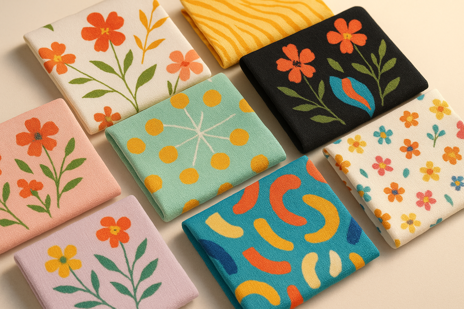
When printing designs on fabric, the base colour of the material directly impacts how bright and accurate the final print appears. White or light fabrics provide the best results as they allow colours to stay true and vibrant. Dark fabrics, however, require techniques like adding a white underbase to prevent colours from looking muted.
Here’s a quick summary:
- White/light fabrics: Best for vibrant, sharp prints.
- Dark fabrics: Need a white underbase for bright results.
- Fabric blends: Synthetic fabrics like polyester retain brighter colours, while natural fabrics like cotton absorb more ink for softer tones.
- Preparation matters: Proper fabric prep, such as scouring and bleaching, ensures better ink adhesion and prevents colour distortion.
Choosing the right printing method (like DTF, DTG, or screen printing) and testing designs on fabric samples can help achieve the desired print quality. For consistent results, working with experienced printers like Custprint ensures precision at every step.
Screen Print Bright Colors on Dark Shirts : 2 Easy Methods
How Fabric Colour Affects Print Vibrancy
When it comes to creating vibrant prints, the colour of the fabric plays a pivotal role. The base colour of the fabric acts as the canvas for your design, either amplifying or muting its impact. For anyone in the custom apparel business, understanding this interaction is essential to achieving the desired print quality. Let’s take a closer look at how fabric shades influence print vibrancy.
White and Light Fabrics
White and light-coloured fabrics provide the ideal base for achieving vibrant and accurate prints. A bleached white fabric ensures that the printed colours align perfectly with the original design’s intent [2]. Because of this, white fabrics are often considered the standard for custom printing.
Even slight variations in the tone of light fabrics can influence the final print outcome. These fabrics allow ink to penetrate more effectively, ensuring better adhesion and durability. As a result, prints on light fabrics tend to retain their vibrancy even after multiple washes, with the neutral background showcasing colours exactly as intended.
Dark Fabrics
Printing on dark fabrics presents unique challenges. Darker colours, such as black or navy, can make lighter inks appear dull or muted [5]. This is why specialised techniques are often required to maintain brightness and clarity.
One effective approach is using a white underbase layer. As Isla Vista Screen Printing & Embroidery explains:
"When printing colours on dark garments, we often suggest to print a white ink layer as an 'underbase' in order for the colours to pop." [3]
Achieving vibrant prints on dark fabrics involves addressing several factors, including ink coverage, colour brightness, and durability [5]. High-opacity inks, such as plastisol, are particularly effective in creating bold, bright prints on dark backgrounds [5][6].
Temperature control is critical when working with dark fabrics. For example, plastisol inks require curing at 160°C to prevent issues like cracking, peeling, or fading [5][6]. Polyester blends add another layer of complexity, as high temperatures can cause dye migration, leading to ink discolouration [3]. Using low-bleed inks and adjusting heat settings can help mitigate this issue.
Direct-to-Film (DTF) printing has gained popularity for dark fabrics, offering a reliable solution. This method uses a white base layer to ensure colour opacity and accuracy, resulting in vibrant prints on dark backgrounds [4].
Fabric Blends and Print Effects
The composition of the fabric also influences how colours appear. Synthetic fibres like polyester are engineered to absorb and retain dye molecules more effectively than natural fibres, making them ideal for designs requiring intense colour vibrancy [2]. This makes polyester blends a popular choice for high-impact prints.
On the other hand, natural fibres like cotton, Modal/Tencel, wool, and silk each interact with ink differently [2]. This means that your printing technique needs to be tailored to the specific fabric type to achieve the best results. For instance, tightly knit fabrics provide better colour saturation and sharper print definition compared to looser weaves, which can cause ink to spread and reduce vibrancy.
Surface treatments also play a role in print quality. Fabrics with brushed or fuzzy surfaces scatter light, which can dilute the intensity of colours [2]. These considerations highlight the importance of selecting the right fabric and adjusting your printing methods accordingly.
For Direct-to-Garment (DTG) printing on blended fabrics, it’s crucial to adjust ink levels based on the fabric's thickness. Thicker fabrics may require more ink, while thinner ones need less to achieve optimal results [7].
Main Factors That Affect Print Brightness
When it comes to achieving vibrant prints, there's more to consider than just the colour of your fabric. Technical aspects like the quality of ink, the printing method used, and how the fabric is prepared all play a critical role. Knowing how these factors work together can help ensure you get consistent, high-quality results, no matter the fabric type or colour.
Ink Quality and Thickness
The ink you choose can make or break the brightness of your prints, particularly when working with darker fabrics. Inks designed specifically for DTF (Direct-to-Film) printing are formulated to deliver bold, vivid colours [8]. These inks are engineered to retain their brightness, even on challenging surfaces.
To optimise colour saturation, adjusting ink thickness is key. Research shows that increasing ink density up to about 4 µm enhances saturation, but going beyond this point doesn't add any noticeable benefit [9]. For darker fabrics, applying a high-opacity white base - often called a "double white" layer - can significantly boost the vibrancy of your prints [4][8].
The importance of a white base layer for dark fabrics can't be overstated. As MTU Tech explains:
"If you use high-quality film with a bright white undertone, your prints will appear brighter and more vibrant." [8]
Next, let's look at how the choice of printing method impacts print brightness.
Printing Methods
Different printing methods bring unique strengths to the table when it comes to achieving vibrant prints:
- Screen Printing: Known for its thick ink layers, screen printing excels at making designs pop, particularly on dark fabrics. This method offers excellent colour opacity and durability, making it perfect for bold, simple designs [10].
- DTG (Direct-to-Garment) Printing: DTG inks are absorbed into the fabric, resulting in smooth, natural-looking prints. While this method creates a softer feel, it may not deliver the same level of brightness on darker fabrics as screen printing does [10].
- DTF Printing: DTF stands out for its ability to handle dark fabrics effectively. It incorporates a built-in white underbase layer, ensuring that colours remain vibrant and don't get muted by darker backgrounds. As MTU Tech highlights:
"The film transfer method ensures colours remain true and don't get muted by dark backgrounds" [4].
| Printing Method | Best For | Brightness Level | Fabric Compatibility |
|---|---|---|---|
| Screen Printing | Bold, simple designs | High vibrancy | Most fabrics, including synthetics |
| DTG Printing | Detailed, multi-colour designs | Moderate brightness | Cotton and cotton blends |
| DTF Printing | Dark fabrics, complex designs | High with white base | Wide range of fabrics |
While ink quality and printing methods are vital, the way you prepare your fabric is just as important for achieving striking print clarity.
Fabric Prep and Treatment
The preparation of your fabric lays the groundwork for vibrant and high-quality prints. Industry studies suggest that up to 60% of defects in textile printing stem from issues in fabric preparation [11].
Proper fabric prep enhances colour intensity and controls ink spread, resulting in sharper, more defined prints [13]. For cotton fabrics, this process typically involves scouring and bleaching. Scouring removes dirt, oil, and grease, ensuring even water absorption and better dye penetration [11]. Bleaching eliminates natural colours, creating a uniform white base that maximises print brightness [11].
Pre-treatment solutions also play a crucial role. These formulations prevent 'wicking,' or the unintended spread of ink, ensuring sharp and consistent designs [12]. This level of control is essential for maintaining brightness and definition across the entire print.
Mattia Perri, Global Application Specialist Inkjet at Huntsman Textile Effects, underscores the importance of preparation:
"Proper fabric preparation can maximise the intensity and brilliance of the printed colours and control how the ink spreads on the fabric, optimising printing definition and delivering a better-looking end product to delight brands and consumers. Selecting the right preparation recipe also makes it possible to decrease ink consumption while maintaining high colour strength, resulting in substantial cost savings." [13]
For the best results, fabrics should be clean, absorbent, smooth, and uniform in width. Consistency in preparation is critical because variability can lead to uneven print quality [11]. This is especially important when dealing with different fabric colours, as each reacts uniquely to the same preparation methods.
sbb-itb-410132b
Print Brightness on Different Fabric Colors
Understanding how fabric colours influence print vibrancy is key when customising apparel. The base colour of the fabric serves as a foundation that can either enhance or diminish the vibrancy of your design. Let’s explore how different fabric colours impact print brightness.
White fabrics are considered the ideal choice for digital printing. This is because most digital printing processes are optimised for white surfaces, providing a perfect backdrop for achieving vivid, true-to-design colours [14]. On light-coloured and pastel fabrics, pigment inks generally perform well, though achieving the same level of brightness as white fabrics can be a bit tricky [14]. On the other hand, dark fabrics present more challenges. Bright colours tend to stand out better on lighter backgrounds, while darker tones often require additional steps to ensure vibrancy.
The choice of printing technique also plays a crucial role in determining the vibrancy of your design on various fabric colours. For instance, screen printing allows for overprinting on coloured fabrics and can even produce white designs on dark materials [14]. In digital printing, especially on darker fabrics, a white underlayer is usually applied to ensure accurate colour reproduction [14].
In summary, white fabrics deliver the brightest and most accurate results. Light and pastel fabrics come close, though some adjustments may be needed. Medium-toned fabrics might require extra care, while dark fabrics, including black, typically demand techniques like applying a white underbase to achieve the desired vibrancy. The fabric material also plays a role: synthetic fabrics like polyester and lycra retain bright, contrasting hues, while natural fabrics like cotton and linen absorb more ink, resulting in softer, slightly muted colours [15].
To ensure the best results, always test your design on the chosen fabric before starting production. This is particularly important when using tools like Custprint's Create it feature, which allows you to preview and refine your design for optimal print results. While white and light fabrics are best for vibrant prints, dark fabrics can create striking contrasts when printed with the right techniques and adjustments. Ultimately, your choice will depend on your design goals and budget.
Tips for Getting Bright Prints
Creating vibrant, attention-grabbing prints on custom apparel requires a good understanding of how fabric and ink interact. Here are some practical strategies to help you achieve bold, professional-quality results.
Choose Light Fabrics for Brighter Colours
If you want your prints to pop, start with white or pastel fabrics. These lighter shades provide the best canvas for showcasing true, vivid colours. Whether you're designing t-shirts, hoodies, or polo tees, white and pale tones like soft pink, light grey, or pale yellow allow your ink's colours to shine through without distortion [16].
The texture and material of the fabric also make a big difference. Natural fibres like cotton and linen absorb ink differently than synthetics like polyester [1]. Cotton tends to produce softer, more muted tones, while polyester often delivers sharper, more vibrant results. Your choice should depend on whether you're aiming for a subtle, natural finish or a bold, striking look.
For darker or less vibrant fabrics, additional techniques are necessary to maintain colour brightness.
Use a White Underbase for Dark Fabrics
Printing on dark fabrics like black or navy can still yield vibrant results if done correctly. The secret lies in applying a white underbase layer. This technique creates a bright foundation that prevents the dark fabric from dulling your ink colours [16].
A white underbase works well with various printing methods and ensures that your designs maintain their boldness and accuracy. It's an essential step when working with darker materials to make your colours stand out.
Partner with Experts like Custprint

Achieving consistently bright prints often requires professional expertise. From colour matching to quality checks, every detail matters.
With over 40 years of experience, Custprint ensures every stage of the printing process is handled with precision. Their "Create it" tool allows you to preview your designs on different fabric colours and provides instant pricing updates, giving you full control over your custom apparel. Whether you're ordering a single hoodie or a bulk batch of t-shirts, working with seasoned professionals like Custprint can help turn your vision into vibrant, high-quality reality.
Conclusion
Understanding how fabric colour influences print brightness is key to creating vibrant, high-quality apparel. Light-coloured fabrics, particularly white, serve as the ideal base for vivid and accurate prints. On the other hand, dark fabrics demand special techniques, like adding a white underbase, to achieve comparable brightness [18][19]. These insights can help you achieve flawless print results.
The fabric you choose plays a major role in print vibrancy. Colours that don’t complement the design can make prints appear dull [17][19]. To ensure the brightest results, opt for white or pastel fabrics. For darker fabrics, applying a white underbase is essential [19].
Testing your designs on fabric samples is a practical way to avoid costly mistakes and ensure the colours look exactly as intended. The growing demand for optical brighteners, projected to reach ₹16,700 crores by 2026 [17], also underscores the industry's focus on enhancing fabric treatments.
For the best outcomes, seek expert advice. Partnering with professionals like Custprint can help you achieve optimal vibrancy and precision in your prints.
FAQs
Why is a white underbase important when printing on dark fabrics?
When printing on dark fabrics, a white underbase plays a key role. It serves as a foundation layer, ensuring that the printed colours remain vibrant and true to the original design. Without this layer, the dark fabric can interfere with the colours, causing them to appear muted or distorted.
Adding a white underbase enhances the opacity of the design, allowing the colours to pop and retain their intended brightness. This step becomes even more critical for intricate or colourful designs, ensuring they appear crisp and professional on dark garments.
How do fabric types impact the brightness and durability of printed designs?
The choice of fabric significantly influences how vibrant and long-lasting printed designs turn out. Synthetic fabrics like polyester are known for their ability to hold inks well, especially when using sublimation printing. This results in brighter colours and prints that stand the test of time. In contrast, natural fabrics such as cotton are appreciated for their softness and breathability. However, they absorb inks differently, often leading to slightly muted colours and faster fading.
Blended fabrics, which mix synthetic and natural fibres, strike a balance between the two. The print quality here largely depends on the fibre composition and the printing method used. To achieve the best outcome, it's important to match the design with the most suitable fabric.
How do fabric colours impact the choice of printing method?
The printing method you choose should align with the fabric colour, its material, and the design you want to achieve. For darker fabrics, screen printing is a great option, as it delivers bold and vibrant results. On the other hand, digital printing shines when used on lighter fabrics, especially for detailed, multi-colour designs.
When it comes to specific materials, dye sublimation works best with polyester, creating vivid prints that stand the test of time. Meanwhile, heat transfer is a flexible option suitable for a variety of fabrics, though it performs best on lighter colours. Always take into account the type of fibre, the fabric's colourfastness, and the level of vibrancy needed. This ensures the print not only complements the fabric but also remains durable over time.